Most people do not struggle to choose a paint colour because they have bad taste. They struggle because they are asked to choose from three thousand of them, under hardware-store lighting, with a fan of tiny swatches and no idea where to start.
That is not a decision. That is a maze.
The good news is that choosing a colour you will love is genuinely straightforward once you change where you start. Not with the swatch wall. With your own room, your own light, and a much shorter list. Here is the whole process, start to finish, in an afternoon rather than a weekend.
Why choosing paint feels harder than it should
The paint industry has sold the idea that more choice is better. Three thousand colours, endless undertones, a swatch for every conceivable mood. It looks generous. It is actually the source of the problem.
When you stand in front of that wall of options, two things happen. You lose your sense of what you actually wanted, and you start second-guessing colours that were perfectly good. More options do not make the decision clearer. They make it heavier.
The other trap is how people sample: a tiny pot brushed onto a patch of wall, looked at once, in one light, then painted over with regret six months later. The colour was rarely the problem. The process was.
So the fix is not a cleverer way to navigate three thousand colours. It is to start from a smaller, better set, and to test the few that matter properly. That is the whole secret, and the rest of this guide is just the detail.
Start with your fixed elements, not the swatches
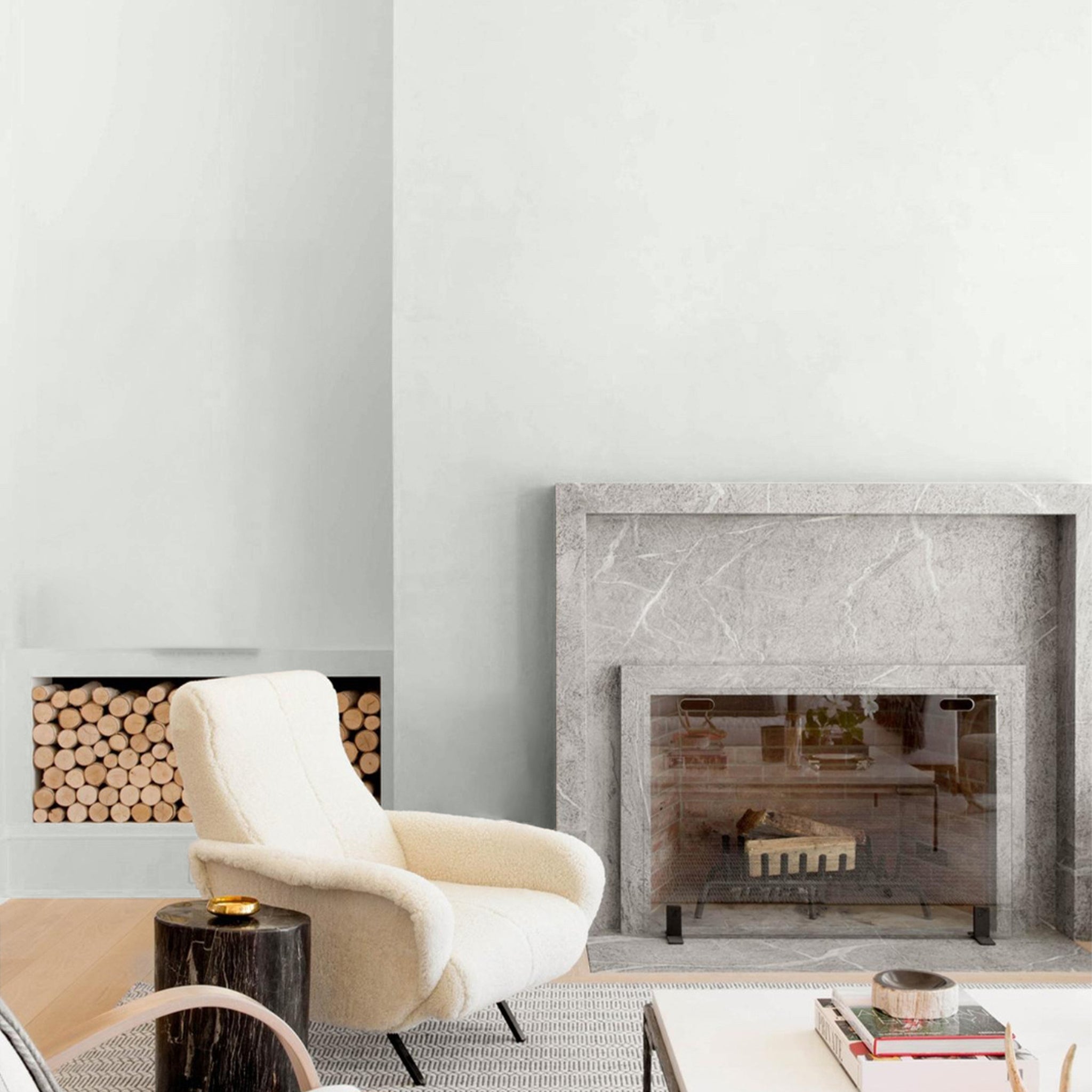
The colours already in your room have decided more than you think. Your floors, your benchtops, your timber, your big pieces of furniture: these are fixed, expensive, and not changing. The wall colour has to live with them, so they are where you start.
Look at the undertone of those fixed elements:
- Warm undertones. Honey or red-toned timber, oak floors, brass, cream stone, terracotta. These rooms want a warm neutral or a warm colour. A cool grey will fight them and read cold.
- Cool undertones. Grey-toned stone, white marble, black hardware, polished concrete. These rooms can carry cooler tones, or take a warm colour to add contrast and stop the space feeling clinical.
You do not need a colour-theory degree for this. Ask one question: is my room warm or cool? Stand in it, look at the floor and the benchtop, and you will know. Once you have the answer, half the palette is already ruled out, and you have not looked at a single swatch yet.
Australian light changes everything
Most paint advice was written under European or American skies. Ours are different, and it matters more than almost anything else on this list.
Australian sun is intense and the UV is high. That does two things to colour. It makes bright, saturated colours feel louder on the wall than they did on the swatch, and it makes muted, warm, earthy tones behave beautifully and predictably. It is one of the reasons cool, flat greys have fallen out of favour here: under this light they tend to read cold and lifeless, where a warm neutral stays calm and alive.
Orientation matters just as much. The same colour will look like two different colours depending on which way the room faces:
- North-facing rooms get strong, warm light for most of the day. Colours read brighter and warmer here, so you can go a touch deeper or cooler than you think.
- South-facing rooms get soft, cool, indirect light. Colours read flatter and cooler, so warm tones do the most work to keep the room feeling inviting.
- East-facing rooms get warm morning light and cooler afternoons. West-facing rooms get the reverse, with a harsh warm glow late in the day.
The practical takeaway: a colour is not a fixed thing. It is a colour in your light, in your room, facing your direction. Which is exactly why you have to test it there, not in a shop. More on that shortly.
Decide the finish before the colour
This is the step almost everyone skips, and it quietly changes how your colour looks.
Finish, or sheen, is how much light the paint reflects, and it shifts how a colour reads on the wall. The same colour looks softer and slightly deeper in low sheen, and a little brighter and harder in semi gloss. So settle the finish first, then judge the colour in that finish.
The rule is simple:
- Low sheen for most walls, including living rooms, bedrooms, hallways, and kitchen walls. It is soft, forgiving, and calm.
- Semi gloss for wet rooms and high-contact surfaces: bathrooms, laundries, trims, doors, and cabinetry.
We cover the full logic in our guide to low sheen versus semi gloss, with room-specific detail in the kitchen and bathroom guides. Get the finish settled, and the colour decision gets simpler.
How many colours does a home actually need?
Fewer than you would guess. The instinct to give every room its own colour is usually what makes a home feel busy and disjointed, and it multiplies the number of decisions you have to get right.
There are two approaches that consistently work:
One colour through the home. Sometimes called colour drenching, this runs a single wall colour across the whole house, changing only the finish to suit each room. It sounds plain. It looks considered, calm, and expensive, because the eye reads the home as one continuous, intentional space.
A backbone neutral with one or two accents. Choose a single neutral for the majority of your walls, then allow yourself one or two deeper or richer colours for the rooms that can carry them: a study, a powder room, a feature wall. The neutral holds everything together; the accents add moments.
Both work because they limit the coordination problem. Every colour you add is another colour that has to agree with all the others, in every light, against every fixed element. Fewer, considered choices beat broad exploration almost every time. This is not a compromise. It is how the best-looking homes are actually done.
How to sample without wasting a weekend
You have narrowed by undertone, accounted for your light, and settled your finish. Now you test, and this is where most paint regret is made or avoided.
Why the usual sampling fails:
- The patch is too small to read properly
- It is brushed straight onto an existing colour that bleeds through
- It is looked at once, in one light, instead of across a day
The better way is a peel-and-stick sample: real paint on a card you can move around the room. Stick it on the wall you are considering, next to your fixed elements, and look at it in the morning, the afternoon, and under your lights at night. Move it to the darker corner and the brighter one. A colour that holds up across all of that is a colour you can commit to.
How many to test? If you started from a curated palette, two or three is plenty. If you are sampling from a range of three thousand, you will need eight or ten just to feel safe, which tells you everything about why the smaller starting point is the better one. Our full approach is in the guide to peel-and-stick paint samples.
Order a sample and test it in your actual light. Real paint, peel-and-stick, moved around your own room. It is the difference between choosing once and choosing twice. Order a sample.
The Good Drop edit: the hard part, already done
Everything above is a method for cutting three thousand colours down to a handful that suit your room. We have done that step for you.
Our palette is curated on purpose. Every colour was chosen for the way it behaves in real Australian rooms and Australian light, and for how easily the colours sit beside one another and beside the things you already own. There are no near-duplicates and no colours included just to fill a chart. If a colour is in the range, it earned its place.
It helps to think of the palette in families:
- Warm and cool whites, for ceilings, trims, and rooms that want light without coldness. Just White is pure and undertone-free; the rest of the whites lean gently warm or cool.
- Greiges and warm neutrals, the quiet backbones of a whole-home scheme. Porcelain Bloom and Blushing Greige anchor a space without drawing attention. Browse the greiges.
- Soft greens, for calm rooms that feel connected to outside. Hush acts almost like a neutral; Sageing is warmer and more grounded.
- Blue-greys and calm darks, for studies, bedrooms, and feature walls. Lake Cloud is serene; the deeper tones bring drama where you want it.
Choosing between them takes minutes, not weekends. Decide warm or cool, pick the family that suits the room, and sample the two or three that catch your eye. That is the entire decision.
A simple five-step method
- Read your room. Warm or cool? Let your fixed elements answer.
- Account for your light. North, south, east, or west, and how the room feels through the day.
- Settle the finish. Low sheen for walls, semi gloss for wet rooms and trims.
- Shortlist from a curated palette. Two or three colours, not twenty.
- Sample in place. Peel-and-stick, on your wall, across a full day, then commit.
That is it. No weekend lost, no wall of swatches, no regret six months later.
Choosing is easier than they made it look
The reason paint feels hard to choose is not you. It is the three thousand colours and the fluorescent lighting. Take those away, start with your own room and a considered palette, and the decision becomes what it should have been all along: quick, confident, and a little bit enjoyable.
We have already done the hard part. Browse the edit, order a sample, and see your colour in your own light.
Frequently asked questions
How do I choose the right paint colour for my room?
Start with your fixed elements rather than the swatches. Look at your floors, benchtops, and timber to decide whether the room is warm or cool, account for the direction it faces and the light it gets, settle the finish, then sample two or three colours on the wall before you commit.
How do paint colours look different in Australian light?
Australian sun is intense and high in UV, which makes bright colours read louder and muted, warm, earthy tones behave best. Cool flat greys often look cold here. A north-facing room makes colours warmer and brighter, while a south-facing room makes them cooler and flatter, so always test the colour in the room it is going in.
How many colours should a house have?
Fewer than most people think. Running one colour through the whole home, changing only the finish, looks calm and considered. If you want variety, use one backbone neutral with one or two accent colours. More colours mean more coordination problems.
How do I test a paint colour before committing?
Use a peel-and-stick sample of real paint. Place it on the wall next to your fixed elements and look at it in the morning, the afternoon, and at night under your own lights. Move it to the brightest and darkest parts of the room. A colour that holds up across all of that is one you can commit to.
What colour makes a room look bigger?
Light, warm tones reflect more light and make a room feel more open, which is why soft whites and warm neutrals work well in small spaces. Using one colour across the walls, trims, and adjoining rooms also makes a space feel larger by removing visual breaks.
Should all the rooms in a house be the same colour?
They can be, and it often looks better than you would expect. A single colour throughout, with the finish changing to suit each room, reads as one calm, intentional home. If you want some variety, keep a consistent neutral as the backbone and add only one or two accent colours.